Pi Healthcare provides stakeholder strategy and engagement for life science organisations, connecting world-leading pharma companies with people of influence. I joined Pi Healthcare in an in-house Videography, Graphic & Motion design role, promoted after two years to Senior Designer, overseeing the other designers and marketers.
Initially we would fly to universities and hospitals across the world, record live medical lectures and edit together comprehensive educational material. This role evolved into rebuilding the company brand guidelines, website and social media posts, as well as miscellaneous collateral.
As you can appreciate, all work is under strict medical compliance. I have recreated or removed confidential information.
Style Guides & Slide Decks
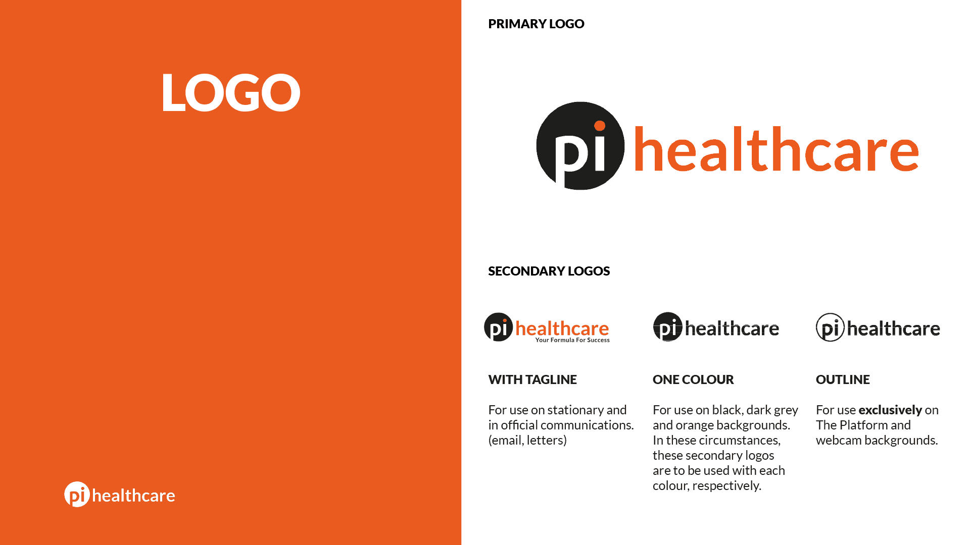
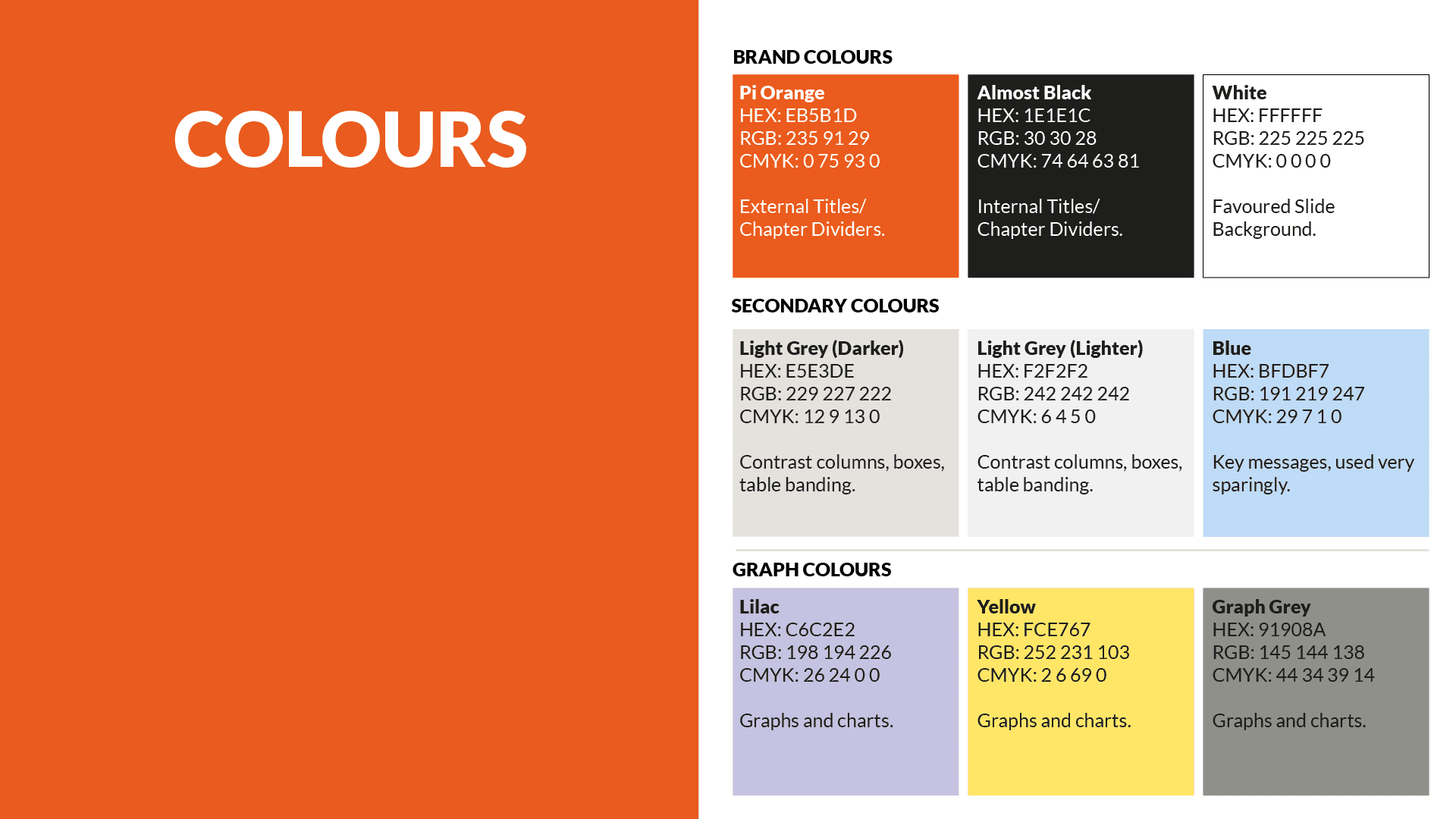
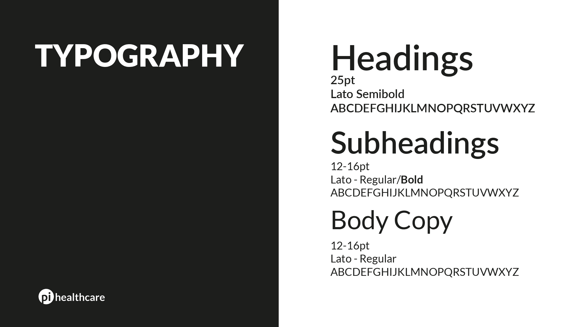
Logos, Colours & Typography
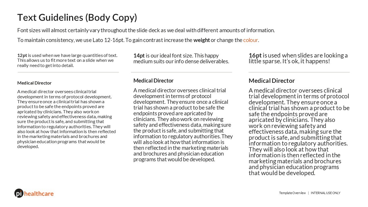
Soon after I joined I knew I had to refresh the brand guidelines. The logo had inconsistencies, the slide decks were cramped and the typeface did not provide adequate flexibility. To remedy this I introduced Lato, a humanist typeface with multiple weight variations.
The logo was remade, with considerations for web and stationary. The colours were also codified. “#EB5B1D” will forever be ingrained in my mind. Variations of the orange made up graph colours, with blacks and greys used as secondary colours. The brand guide would be updated after two years to include more colours, mission and vision statements, brand values and writing guidelines.
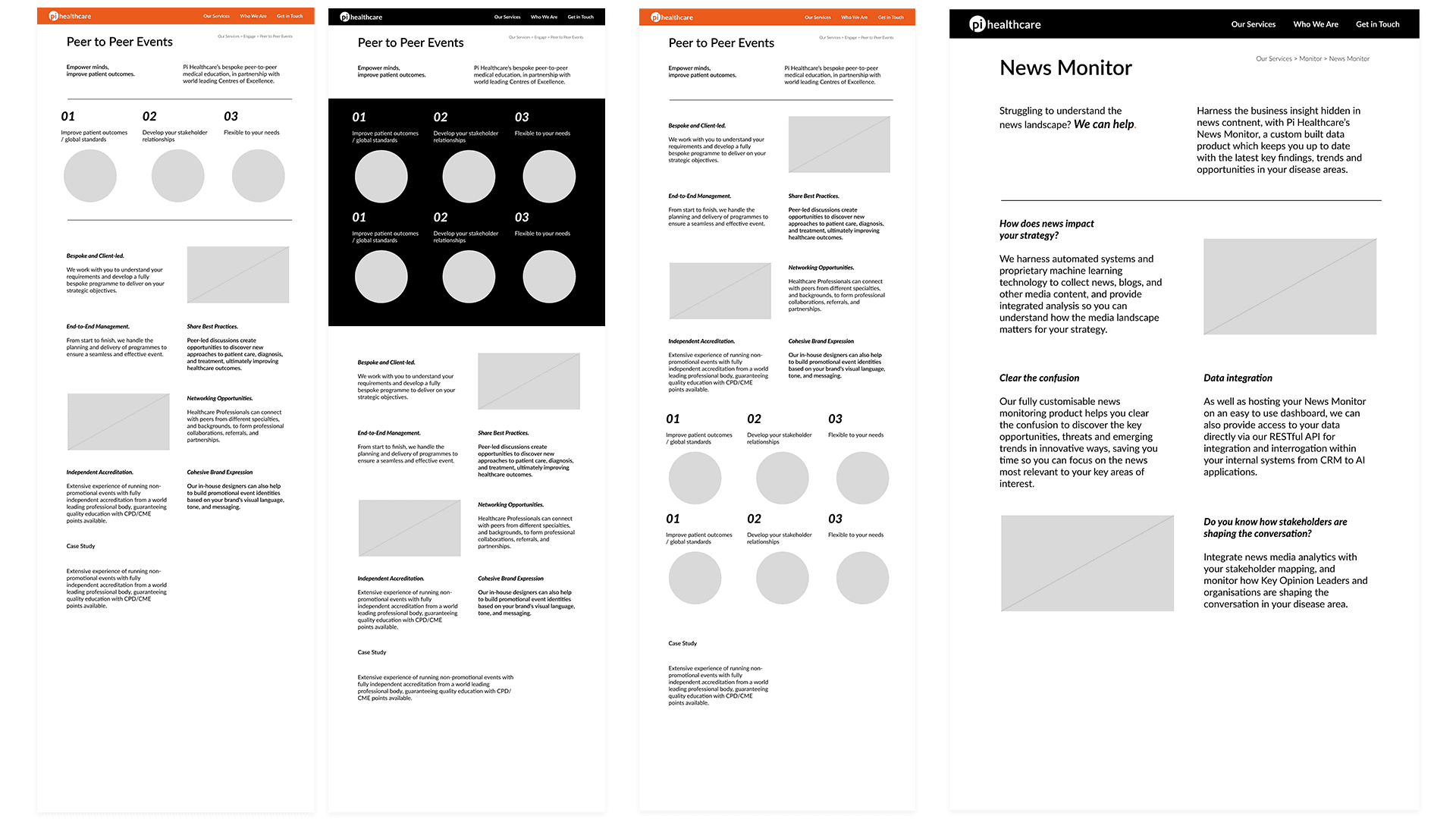
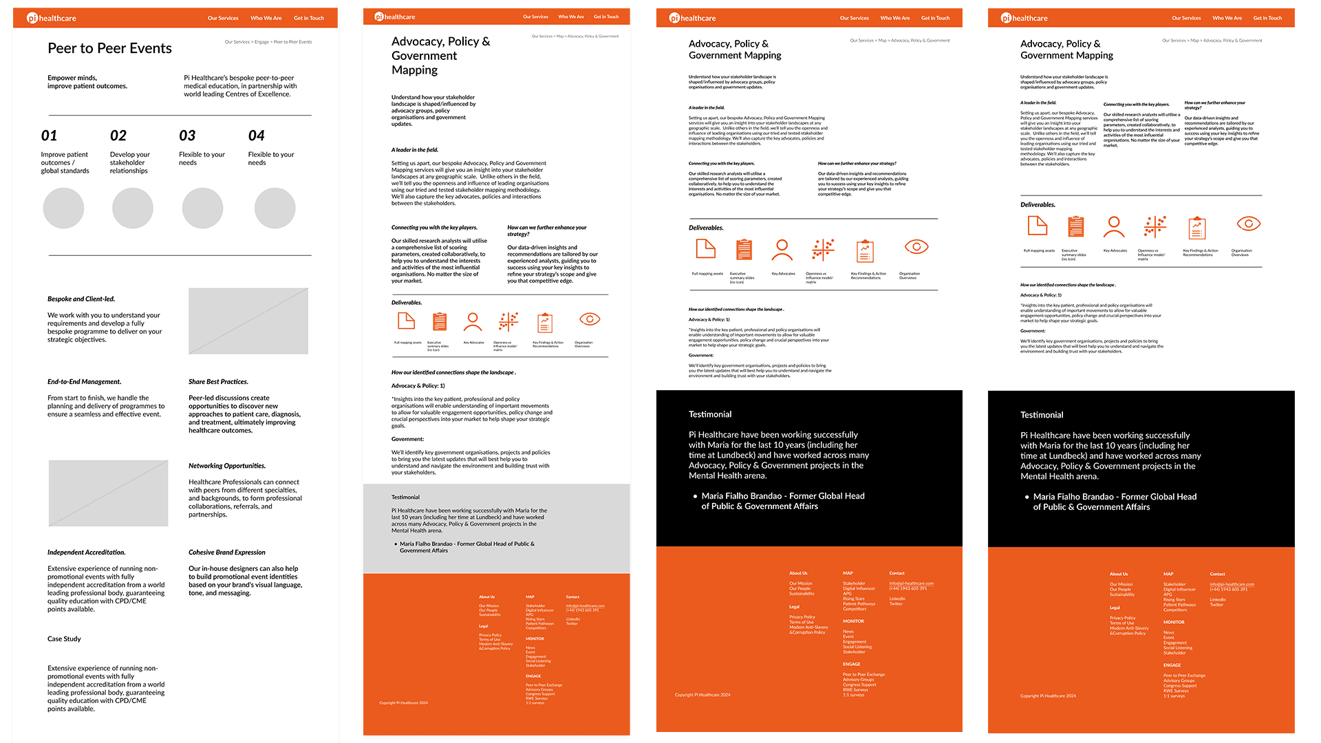
Slide Decks
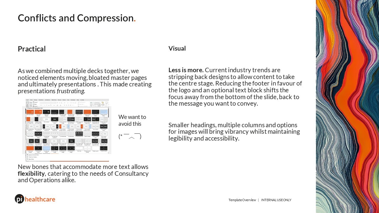
Creating slide deck templates to fit the needs of the Consultancy Team provided a challenge. Often text and data heavy, oversized titles, a thick footer and floating logo caused frustration amongst the SLT and analysts. Using Lato and a "less is more" approach the slide decks were rebuilt and streamlined. I experimented with dark mode slides for tech heavy presentations, provided multiple options for footers and settled with bold chapter slides.
As the brand guidelines were once again refreshed, the slide decks were opened up even more. The footer was completely stripped in favour of a logo in the corner and optional footer text. Full bleed image placeholders were offered as well as variations with multiple columns, akin to a magazine or newspaper.

Videography / Editing / Event Graphics
Live Medical Recordings (Preceptorships)
Preceptorships are medical lectures given by professionals to professionals. They make up the bread and butter of the Operations Team. We create save the date posters, event invites, slide decks, holding slides, event signage, anonymise patient videos and photos in preparation for the physical recording.
We travel to the relevant centere of excellence and record the lectures using a staggered two camera setup, recording audio using wireless mics straight to OBS. If the preceptorship was online, we would record using Teams or Zoom.
These lectures and interviews are then cut together as a multicam sequence in Premiere Pro or Davinci resolve (for colour grading and blurring faces as per medical compliance). Subtitles were handled using Rev, and stylised in Premiere. Slides were screen recorded, but often synced and replaced with PNG versions we could edit if required. Audio was cleaned using Premiere, though for tougher edits Adobe Audition was used. Later we would run audio through Adobe Podcast to do most of the heavy lifting, then refine in Audition if/when required.
I created workflows and processes to ensure quality edits at much faster rates (from two days per video to half a day per edit). This included a file storage system to keep edits streamlined, and track changes. I then taught this new system to other colleagues, providing custom learning resources.
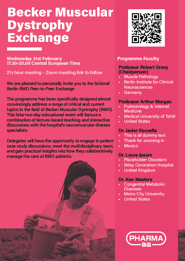
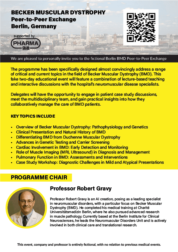
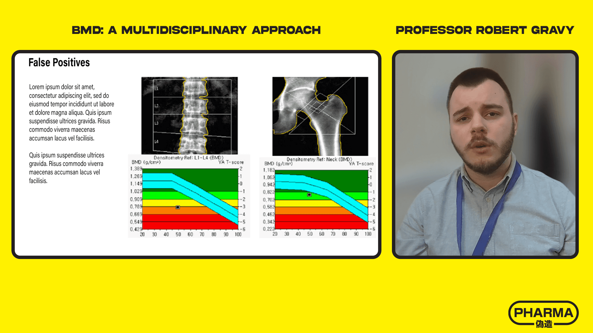
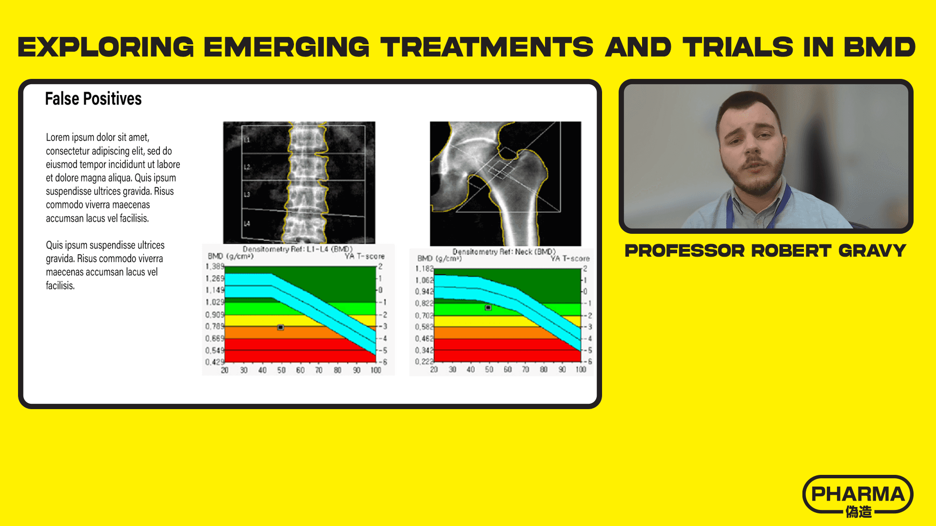
To reiterate, the following invites, events and assets are fictional, but do reflect the style of client deliverables.
Event Invites
Event Overlays
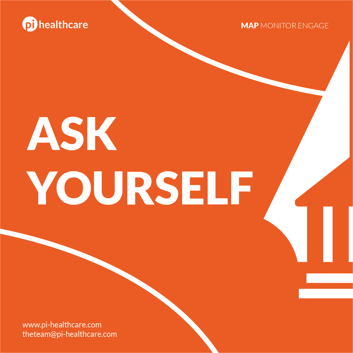
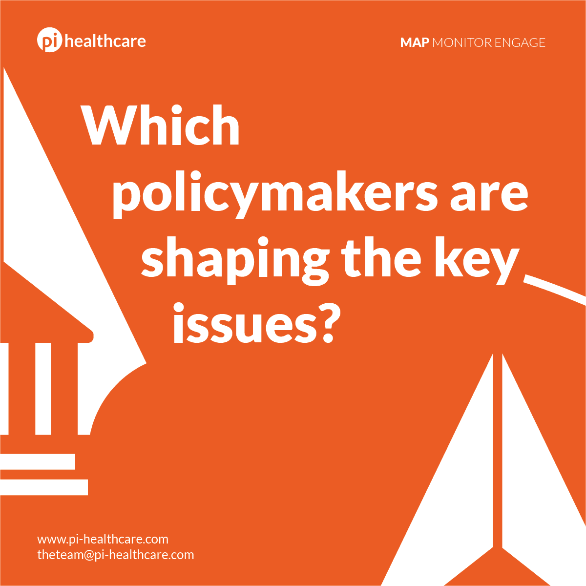
Social Media Campaigns
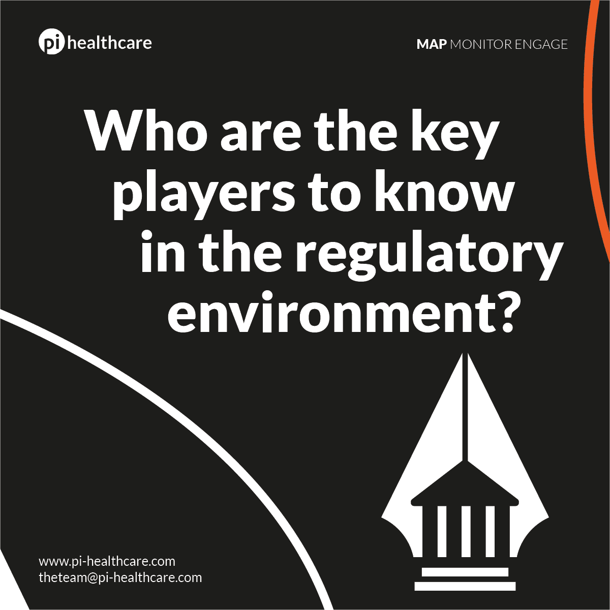
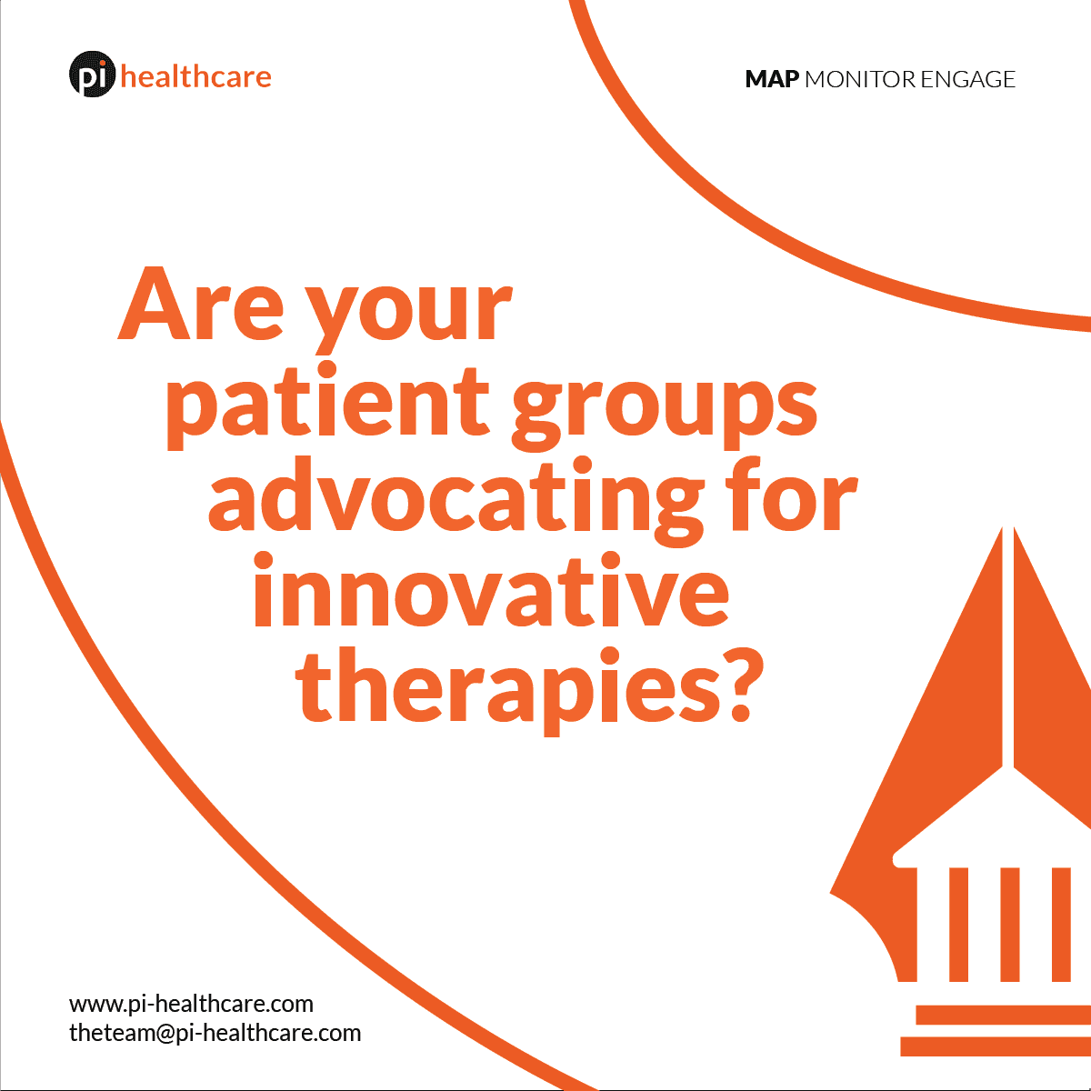
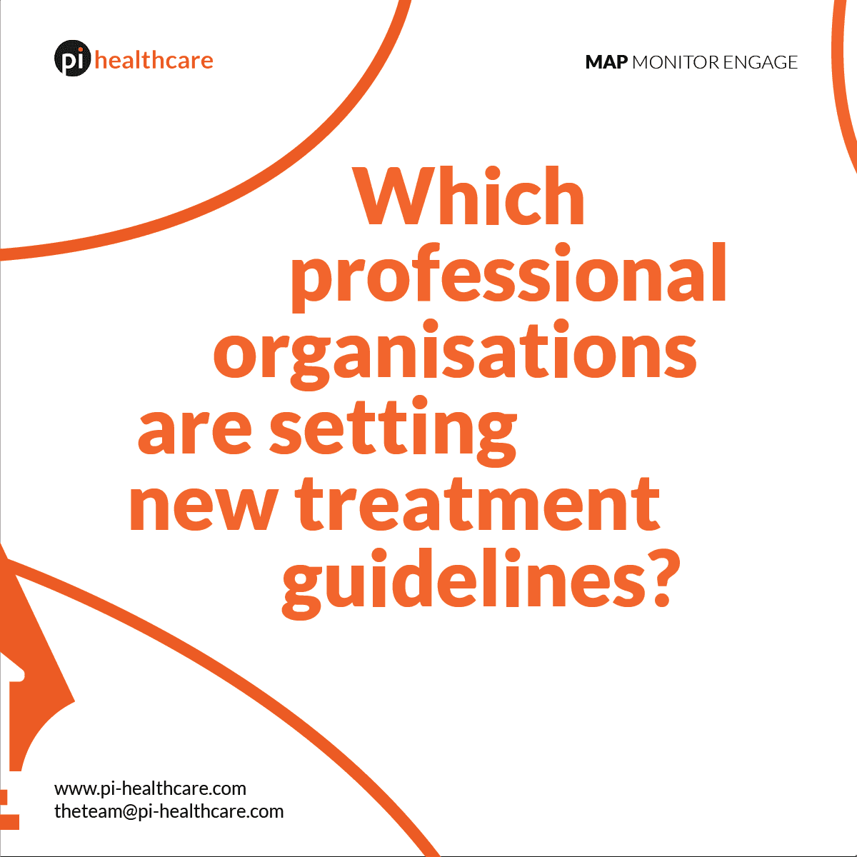
Pi Marketing Campaigns
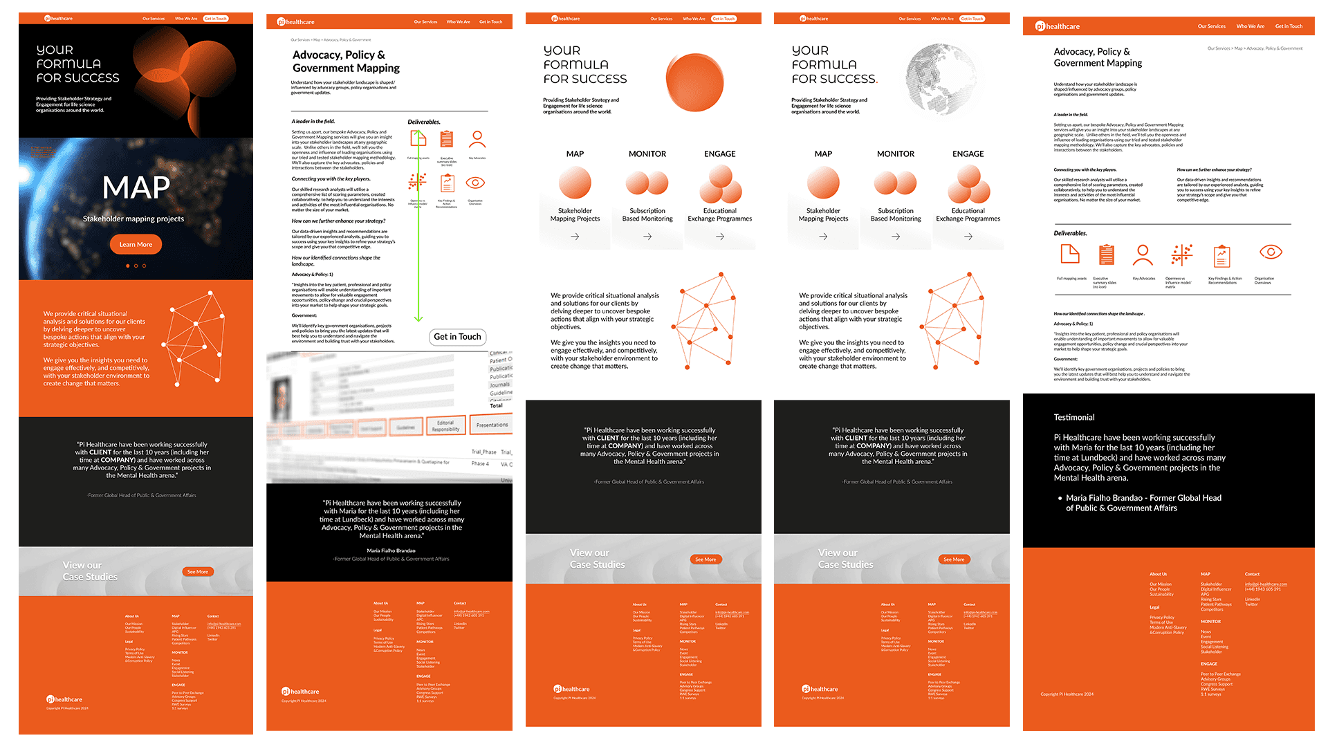
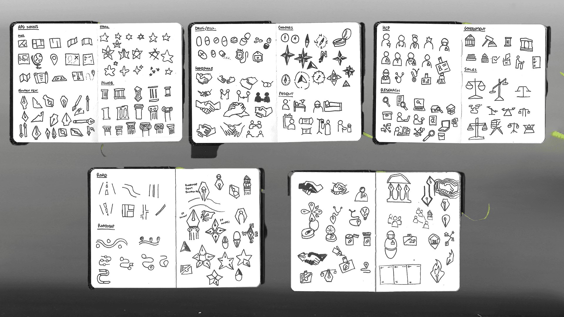
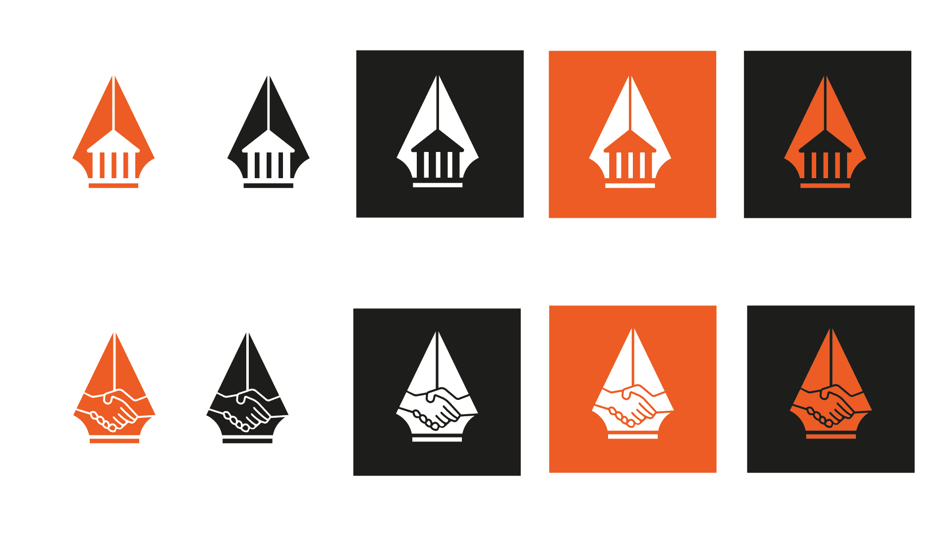
One of many service campaigns, the Advocacy, Policy & Government mapping promotion followed a process inspired by Allan Peters’ approach. An initial meeting sat every stakeholder down to independently and anonymously write a list of nouns associated with the service. This was collated and reduced to 14 approved words we would base our icons on. These icons were then combined with each other to produce a logo for the service area. Paper sketches were later refined in Illustrator to be used in animations, carousels and email banners.
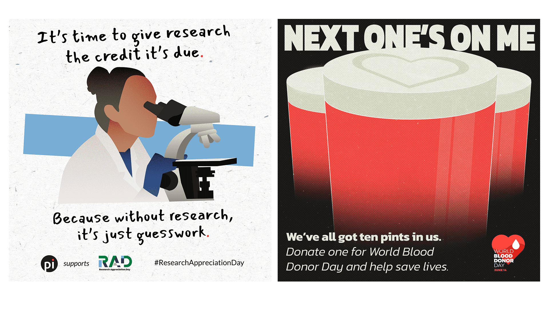
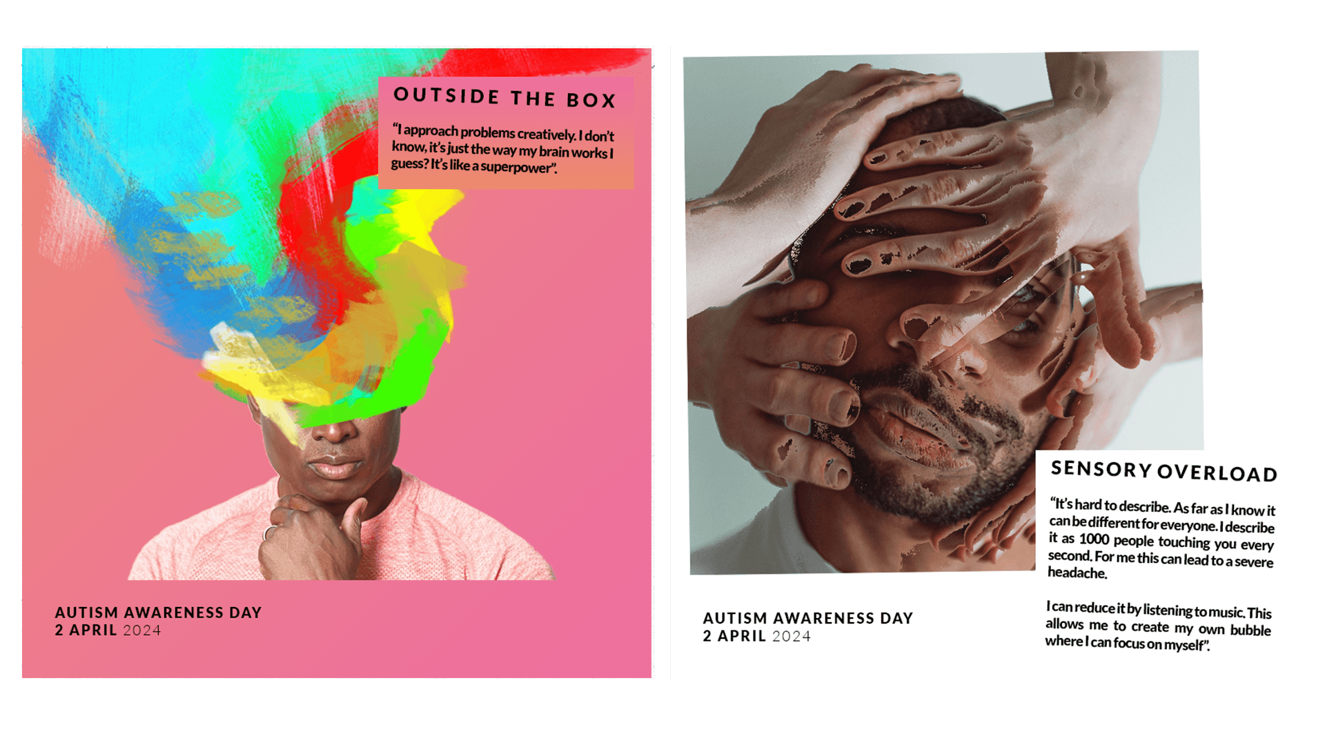
Awareness Days
Awareness day posts provided a blank canvas to experiment and refine new styles. We were given free reign on most posts, though we aimed to add a Pi flavour into larger awareness day campaigns.
These posts served to remind our clients and peers we are knowledgeable regarding various disease areas and are willing to participate in their goals.

Web Design / UX / UI
Website Refresh
Sketched on paper and prototyped in Adobe XD, we rebuild the website using Webflow - using an ethos of connections and clean angles. Simple sections would alternate between text and image, with limited interactions.
As the brand guidelines were refreshed and core pillars were restructured, a new, new website refresh was required to reflect the Map, Monitor, Engage ethos. This time prototyped in Figma, I took the lead role designing and building the site.
This time the foundations were built on UX principles, focusing on accessibility and utility. Interactions were integrated early on in the sketching phase, as my understanding of web design improved. The curtain was slowly peeled back, revealing more of our processes and clearly outlining our services, which was reflected on the site.
The full page footer acts as a catalogue, whilst the main nav contains a dropdown that outlines the three pillars, and the associated services within them.